Syncopated image of Sydney. Credit: Louise Beck

Caption: Syncopated images of the city.

Artist Louise Beck loves being in the thick of things

The bus stops outside, the park across the way is a green solace and with its swimming pool, home to a steady flow of people. Cafes of all design vintages and styles, foods and specialist coffees, dot the urban landscape, and the Factory Theatre is down the road.

When long-time artist Louise Beck decided finally that she had to open her own gallery, there was the slight obstacle of where to have it. A patient, painstaking search followed until she found her spot at 371 Enmore Road; her city gallery/studio would happen here.

Beck’s November retrospective showcases work from her Gallery 371 which will also be celebrating three years. The oils feature Skyscapes which, as she writes, “focus on Sydney and its glass skyscrapers, their reflections, their distortions and their refraction of light, colour and image. The result is an organic and somewhat surreal view of our wonderful city.”

It was this depiction of the newest and the most historic city buildings that first attracted me to her work. I had heard about Beck via Thanh Tam Cao Tam, who had been part of students’ groups at Julian Ashton Art School and still sees her.

I visited Gallery 371 as part of an Inner West creativity trail, and it took a while to click why Beck’s name was familiar to me. Tam had praised her.

The trail brochure had a picture of what I like to think of as a syncopated, twisting, Centrepoint Tower, a ground-to-sky enticement, visual music to an eye accustomed to more touristy images, a commercial impulse taking you to the top.

Remarkably, two years later I find out that her best friend during student days and still a good mate is married to a cousin of mine, an Australian living in Europe. Such a connection and coincidence seemed perfectly natural in this milieu.

For someone raised in regional NSW, ending up on a busy street where cars and buses pass constantly and planes fly overhead, is not something she would have expected. Yet, Beck’s place is like a pop-in community centre. I sat on the chair behind the desk she usually sits in while she settled to the side on a stool, and we talked. At the end, she said, “I have never talked so much about myself as I have with you.” Which is all fine with me.

What was her upbringing like?

I was born in the city but grew up in the country. My father was a postmaster, so we moved around a lot. The longest place we lived was Finley, down by the Murray River NSW. We were there for six years and then came back to Sydney for high school. I got two scholarships in the late 60s) then did English and history teaching. Once I had taught off my bond the very first thing I did was resign from teaching and go to art school. I had always wanted to go. I got my training at Julian Ashton Art School.

Why did you choose the gallery’s location? What were you looking for and how does the space reflect the city’s influence on you?

I lived in Balmain for 16 years. It was an 1884 house and I had a studio upstairs. I used to struggle down the narrow, steep staircase – it had huge banisters – and I thought I was going to end up breaking my neck. I also painted in Addison Road for about six years. All the time I was thinking that I wanted to find my own art space. Then I got to know this area really well, and realised it was full of artists and was quite edgy, which Balmain wasn’t.

I like diversity. That’s why I got so bored in Balmain because there is no diversity. I miss some of my friends, but I tell you, I’ve probably met two times the number of people here than I did in Balmain.

Reflections of Sydney. Credit: Louise Beck

Anyway, I kept looking for about four years, and I found this place. It had been a backpackers place and was in terrible condition but it was on the market and I thought well it’s opposite this beautiful park, has a bus stopping at that door, it’s in a nice, edgy part of the world and 10 minutes from King Street Newtown, so I thought this is it.

I had a building inspection, but they failed to find the rising damp, and then they failed to notice that upstairs was built over a box gutter, so once I had all the lighting in the gallery the ceiling then collapsed. I virtually had to rebuild this whole place. The rest of the house, mind you, was quite solid, old but solid. I had a great builder and together it took us about six months. I lived here all the time, because I was painting, getting ready for the opening exhibition.

Has the space worked out as you hoped?

To be honest when I moved here, I saw it more as a lifestyle change than as a working venture. Then I began to display my art and people came in off the street. They so obviously craved spaces like this. I opened in November (2016) and by January I had the first show of another person. It has become a business, which is lovely. I have met so many artists in this area. I was really chuffed as that was not what I set out to do. At one of the openings, I ran into a young woman who said, ‘I don’t know whether you realise this, but you have created a real artistic hub. I’ve come to a lot of your shows.”

What is particularly surprising to her?

I feel as if I am part of a community and have an open-door policy. Yet I tend to be a rather private person, so I felt at first, ‘Oh my God, I am on display here, but when the postman knows your name and you know his name, and the butcher round the corner always waves when he’s going home, that’s a lovely sense of community. I have been very fortunate.

What are you looking for in the artists that you show? Is the subject matter important?

I am not specifically looking for a particular subject but more at the artist. I quite like the idea, at this stage of my life, that I can be something of a mentor to the artists because a lot of them are younger. I have nurtured some classically trained artists. I also like the vibrancy of street art and I have had a number of street artists in here. I just love their attitude, that energy. It’s refreshing. I want a variety of artists. I have knocked back a couple who were not quite ready, but I don’t mind all those things that push boundaries. That’s what art is all about. I welcome them all, trying to break down that ridiculous mystique that we Australians seem to have developed about art and artists. I can see as people walk by they’re interested but they are too scared to come in because they think you are going to pounce. But I often find they come in more when I am here. It’s less intimidating for them. Europeans, the backpackers, just come in, and look at art and talk to you. They are not at all intimidated by it, but we Aussies, I don’t know.

The number of galleries is growing, in Glebe, for example, and I try to patronise them. The government doesn’t put a buck in the arts, you know (whereas) my son is in the film industry and they have work in New Zealand all the time.

Cranes in Sydney look to the future. Credit: Louise Beck

Who is her main clientele, and do they reflect the area? I

European travellers and backpackers may not buy but they love looking. Not everyone can buy and it’s nice if they just come in and see things. I could not tell you who my average clientele is. I have neighbours who buy quite regularly, which is lovely. People come in off the street because they have seen something that they really want, but I can’t say there is a clientele as such. This is an arty area in so far as there are lot of young poor artists around. We also have the diversity of old Greeks and a lot of Aboriginals. Obviously when someone has a show, they bring their own people, and there is the gallery mailing list. There’s a bit of cross pollination going on.

The cafes round here are very supportive too. They’re great. They are always happy to take invitations for the next show.

Do you specialise in any type of paint?

Yes, oil based. I do the odd charcoal too, but have never used acrylics. I have never been interested in water colours. I like good quality oils. When you are younger you can’t necessarily afford them and I sometimes think if you really want to do something you can create it with whatever is at hand. I painted for many years with a Czech guy. We went together to the Czech Republic and painted there. We used pencil and charcoal and people treated us like royalty.

Where does the city work fit into your schedule and thought process?

I have an instinctive love of portraiture. I can whip up a portrait like that. I must do more of the portraiture, which I enjoy, but the city work intellectually stimulates me. It’s hard to say how long it takes. I tweak and do that is and that. I realise I have only touched the surface. I have been doing them for 10 years and now I know there is so much more I can do. I need more patience. Sydney can’t stand still. It is changing. This is reinforced when you paint reflections in glass. Move one inch and the reflection changes. I want to get this fluid organic quality. I want people to get that feeling of, ‘oh, what am I looking at now? Am I looking through a window or am I looking at a reflection in a window?’ I like that. I like the viewer to stop and think about it. While I did not consciously set out with that concept of chronicling, I was soon into it. I realised that was what I was doing.

Is that how art often works, taking you to places?

Absolutely. I don’t set out with a clear plan because that often hampers you, so you let the canvas speak to you a lot of the time. Nowadays, you can paint on stretch canvas and you don’t have to worry about frames, and that makes it much easier. I have always stretched my own, but for these very big canvases, it is very physical, so I now get this young guy up the road to do it for me. You have to stretch the canvas this way and then that way. I can do the small ones but the big ones, oh no. He has just started out and we celebrate our birthdays together. He carries my business cards and I carry his work. I like the community help; it is very nice.

What does the city mean to you as an artist?

It’s my life blood. I don’t understand people who want to go to the country. Three days is maximum for me. I like to be in the middle of things. I hate being able to see the horizon. It makes me feel really depressed. I always think Russell Drysdale must have been a depressed man. He has come from luscious green England and I see his paintings, and I just want to howl.

I am doing more on Newtown because it has changed but still has gorgeous facades. Paintings can show the past, present and future. I do cranes. Centrepoint Tower has a view, a skyscape (of now) but whack a crane in the background and it shows a future. I do that often in my search for new reflections,

Photographer Anke Stäcker, image from city in Poland

Caption: Stäcker’s images refashion city remnants such as this plump sofa outside a ruin that is still habited in Poland’s Władysława Hinterhof district. Photography ©Anke Stäcker

Art in the city: the joy of discovery for Anke Stäcker

I love going to galleries and thoroughly enjoy the tours of contemporary galleries that I have done with photographer and art lover, Anke Stäcker.

Going around galleries was always an important part of my travels, mixing the must-see nationals with as many smaller, independent ones that I could find.

Gallery opening hours in Sydney though often elude me – different days, different times each day, with long walks from the nearest public transport (or parking spot in the choice suburbs in which galleries are often located). At least I get to know Sydney’s backstreets, and backstreets, as I have found, are home to many an unlikely exhibition.

For directionally challenged people like me, attending Discover Sydney’s Contemporary Art Galleries tours, run by the WEA for the last few years, is a huge help. No longer on my own I reach the outlets, well-known ones and others down those backstreets and laneways, meet gallery curators, artists, learn a thing or two about their history and current exhibits, and mix with other art-lovers also on the walks.

The WEA tours are taken by Anke Stäcker, a photomedia artist who also calls herself “an urban explorer”. She came to Australia from Germany in the late 1980s and has led tours since 2010. Over the several years I have visited galleries with Anke I have learnt the joy of discovery. Her eyes light up when she tells us about a new gallery that’s opened in Sydney’s hidden corners. In contrast, her face creases up in disappointment when she relays news of a closure, the last about the dearly departed Watters Galley. But there will always be another avenue, another renovated industrial warehouse, another staircase to climb within many of these character-filled outlets.

Why did you decide to run the WEA’s city gallery tours? Had you run any other similar tours before this?

Anke: It was a coincidence as a friend of mine was running tours through the WEA before me and we often talked about it. When she went back to live in Germany, she passed the contact on to me. I applied with a new course outline taking into account the newest changes in the Sydney art gallery scene.

I like to show people the variety of art galleries in different neighbourhoods. Apart from the art, they also enjoy the experience of being in parts of the city they may not have seen before.

Have there been any standouts for you and your students over the years?

Standouts are usually when a few things come together. From my experience these are:

  • Special events, like the Sydney Biennale or other bigger events at Carriageworks or the National Art School Gallery, but also the discovery of hard-to-find galleries.
  • Talks by artists, directors and gallery managers to the group.
  • When the people in the group are enthusiastic about the art and galleries, and they see and interact with each other and the tutor.

How important do you think it is for a city to have many smaller, private and/or cooperatively run galleries and not just the more establishment ones?  

Smaller privately or artist-run galleries are important, because they indicate that the city is alive, that there are people with ideas and initiative. However, some of these enterprises can’t survive, often because of high rents and low income as many of these initiatives are driven by showing cutting-edge art and not by making a profit. On the other hand, the establishment, larger scale ones are contributing enormously to the art scene in Sydney. I am personally impressed with Carriageworks, located in the old Eveleigh Rail Yards in Redfern. They bring outstanding international and Australian contemporary art to Sydney.

For a decade or more the grungy, working-class Chippendale and adjacent Darlington had been the best-kept secret to find small alternative galleries and artist-run initiatives. After the redevelopment of the old Carlton Brewery into Central Park (in 2010), a new phase began with the establishment of the Chippendale Creative Art Precinct. This not-for-profit organisation promoted Chippendale as a creative cluster and cultural hub and sponsored new galleries. One of them was the Kensington Contemporary in Kensington Street where I had a solo exhibition in 2016. Then, in 2017, the precinct folded and subsequently their sponsored galleries closed. However, a new commercial gallery opened in the same year and I am sure other initiatives will follow. And, of course, there is the amazing White Rabbit, a philanthropic enterprise with thematic exhibitions of contemporary Chinese art. It is still worth going to Chippendale.

For a long time, East Sydney only had the Watters Gallery, then two others followed. All of them were a bit too far apart to do a walk in that area. Now there are so many that you can’t include them all in the one walk. Damien Minton was the gallery manager of the former Watters Gallery. Visits were particularly interesting as he took the group to the extensive stock area and talked about the history and mission of this gallery with its legendary directors having run it for over 50 years and nurturing artists along the way. Other galleries in the area are equally welcoming. 

Watters Gallery closed at the end of 2108 because Frank Watters and Geoffrey Legge, the founders and directors, retired. While this is the end of an era, East Sydney is still one of the most vibrant art environments in this city. These developments show the fluctuations and dynamics of the art scene in a big city. Therefore, it is essential for a gallery tour guide to be alert about these changes and it is almost impossible to predict six months in advance which galleries will be visited.

What do you hope to instil in your students?

I hope to excite and inspire and make them go back to the places we’ve visited. I want them to know where the galleries are and realise that they don’t have to be intimidated to enter a gallery, and that they are also welcome to go to the openings.

Does taking the tours feed into your own work?

It does in that sense that I want to see what other artists do and I also want to be up to date about the galleries.

NB: It’s not a coincidence that other classes Stäcker takes have a city bent. I have been on a photography class where we took photos of city streets from different points of view and specific approaches such as blurring, colour contrasts, lines and circles. I also went to Forgotten Female Artists of the Weimar Republic, which included Jeanne Mammen, who observed Berlin through its streets, cafes, cabaret (including Toulouse-Lautrec like dancers), androgynous fashion, and what she called “new women”. Having survived World War II, she then thrived during periods of post-war creative expression.

The Other Art Fair, for the last two years, has been held in the inner-city, at Redfern’s ATP (Australian Technology Park).  At this Fair, you talk to the artists themselves rather than gallery owners. For city makers, it is about urban inspiration and how they chose to depict cities.  


City maker Elizabeth Langreiter: eternal, beautiful Sydney

  • Why use city imagery?

My husband is Austrian, and we had the opportunity to move there and experience Austrian culture for 18 months in 2013-2014. Our boys also had the chance to go to school and learn to speak German. While I really enjoyed the experience and had my own studio there, I missed my home town of Sydney. I kept seeing all these amazing photos of Vivid Sydney on Facebook from all my friends, which made me very homesick and totally inspired me to paint my own version of Sydney Harbour. This painting was very well received by the Austrians and sold very quickly. That was the first of many paintings inspired by beautiful Sydney.

  • How does this fit in with your other themes?

At the time I was painting a lot of colourful abstract art, which I really enjoyed.  But I also started to enjoy working in different styles and both my abstract and whimsical styles were becoming popular. I also missed the beach and water and started to paint the water in an abstract and textural style.

  • What city subjects do you show?

I now paint beaches and city scapes often from an aerial perspective and with a 3D effect. I sometimes include people. When I do, they are little 3D people built up with many layers. My paintings are always colourful and happy. I want people to smile and feel good and perhaps evoke a happy memory.

  • What materials do you use and why?

I use acrylic paints and many different mediums, such as impasto (thick layers of paint), modelling paste, dry mediums, varnish and, in some paintings, resin. Many of my paintings are mixed media on canvas.

  • Where is your work exhibited?

I exhibited for the fourth time at The Other Art Fair (2018). To be recognised as one of the top emerging artists in Australia Is a great honour. I also exhibit at The Milk Factory, Bowral and Wentworth Galleries in Sydney CBD. I participate in many other art fairs including The Lindfield Art Show, The Kings Art Fair, The Balmain Arts and Craft Show and St Thomas’ Arts and Craft Show in North Willoughby, and regularly exhibit at Martha’s at Castlecrag and Tallwood at Mollymook. I am also the solo artist at NOC (No Ordinary Café) Willoughby and the Castle Cove Cafe on Deepwater Road Castle Cove.

  • Do your future plans include city work?

Yes. I will definitely be painting more city scapes. I never tire of painting my favourite places in Sydney. which include the Harbour and Opera House and beaches, especially Balmoral and Bondi Beach.

  • In portraying the city, what was the biggest decision you had to make and why?

My biggest decision is to find a composition and perspective of our city that is interesting and beautiful to me. I look at hundreds of images to get motivated for my next painting.

Bondi Beach

Sydney’s Secret Beach

Swimming at Balmoral

Weekend at the Beach

www.elizabethlangreiter.com


City maker Clinton Gorst:  downtown, high-rises, nature 

  • Why use city imagery?

Since a child I’ve always loved being in big cities, the huge buildings, the energy of the streets. This transpired into my fascination with architecture, and I draw that content into my work more and more. I lived in London for many years in the 1990s and loved the juxtaposition of that city – the ultra-new clashing with the super traditional. Other cities like New York appeal for cultural references, while in Sydney I’m always marvelled by the amount of natural beauty moments from anywhere – coastal beaches near busy urban areas – it’s heavenly, and unlike most cities on earth for this reason.

  • How does this fit in with your other themes?

I’ve been integrating architecture into my collage works for a while now, and the chance to create my own hybrid buildings with collage is a big appeal. I still may tell another story in the final result of the image, and the architecture could be background for this purpose alone.

  • What city subjects do you show?

A love of downtown, and highrises/skycrapers, the busy streets that curl around buildings like veins, interesting parks and recreational areas, beaches and blue skies also dominate some of my works. I used to use a lot more people in my art, but that has slowly been retracting, as being more anonymous I think has bigger appeal to viewers – by placing themselves in the surreal context.

  • What materials do you use and why?

Paper collage / photomontage, all resourced form a huge library of second hand books and magazines collected over the years. Vintage eras like the 1950s to 1970s particularly thrill, especially the hard brutalism of architecture at the time, and a sense of future utopia. Once all the pieces are hand-scissored, I then glue the collage onto a wood board frame and spray with a protective matt spray. The artworks can then be framed or hung on their own after this process.

  • Where is your work exhibited? 

In 2017 I participated in group shows in galleries in Berlin and Barcelona after they discovered my Instagram account which was a thrill. I also was part of This Is Sirius exhibition at the National Trust in Sydney to raise awareness of the stunning Sirius building, which sadly is in danger of development and/or destruction. I also showed 18 pieces in Sydney at The Other Art Fair in October which was a great success and an interesting exercise with direct contact with the public.

  • Do your future plans include city work?

(When we spoke, he was excited about the Other Art Fair happening again, for which he built a new body of work.)

  • In portraying the city, what was the biggest decision you had to make and why?

Finding pieces to fit within the city context is tricky and complex, so each decided piece is extracted from the original resources before adding. The city naturally takes on a montage life of its own.

@clintongorst.art


City maker Evan Pank: streets, rallies, activism

  • Why use city imagery?

My work utilises imagery of football stadiums and the streets that are found in cities across Australia and the globe.  The inspiration for my work stems from my own passion for football (soccer), supporting Sydney FC across the country for several years and my time in Europe which exposed me to many different supporters, cultures and environments.  The football stadium is often regarded as the second home of fans and is one of the most iconic parts of a football club’s identity.  It provides a regular meeting point for small communities or whole cities and it is here that people from different backgrounds can come together or be segregated and play out their rivalries with other supporters.  The emphatic support from football fans around the globe through songs, flags, flares and tifos (scarves, drapes, flamboyant displays) creates an environment where the stadium becomes a space of boisterous public expression.  The strict rules and expected public behaviour can be thrown aside in an emotional outpouring that is exemplified in the stadium but also expands out into the streets of the city and in the pubs.  The streets in the city are also a place where fans get to promote their team and build up to the game marching through the streets en masse.  The scenes of thousands of people marching together under one banner and chanting, singing in unison also draws parallels to political demonstration.

  • How does this fit in with your other themes?

The main themes found in my work are of expressive football fans, commonly utilising flares and smoke.  Continuing from this, I also show supporters engaging in political activism in the stadium and using football as a political tool.  Expanding further, fan marches and political protest in the streets, where the environment is reclaimed from the usual monotony of day-to-day life and becomes a platform for the people.  Finally, I use imagery of clashes with police and particularly riot police. Now, most of this imagery is coming from overseas where shields, helmets and armour aren’t an uncommon sight at rallies; they are also something that seems to be increasing in Australia in our police forces.

The combination of emotional football support and activism found in my work is emphasised through the context of the stadium and street blending together, as shown in my artworks, Keeping the Bastards Honest, 2016 and The Twelfth Man, 2017. Other artworks I have produced focus on the arena of the stadium and examining fan support contained within this structure.  Three artworks that show this feature the supporters end of the Sydney Football Stadium with the Sydney FC fans; one end of the A. Le Coq Arena in Tallinn with the supporters group of Nõmme Kalju; and the final one an image of the Ďolíček Stadium in Prague with the supporters of Bohemians 1905, set against the winter night sky and the faint image of apartments behind the ground.  Bohemians 1905 was the first European team to tour Australia and they took back two Kangaroos to Prague Zoo.  They changed their logo to a kangaroo after the trip and are also known as a traditional football club that is owned by the fans and against the corporatisation of football.

  • What city subjects do you show?

While city imagery and particularly stadium imagery is prevalent in my work it is the context that drives my decision for what is included in an artwork. This applies whether I’m creating a work about Australian fan support and activism, the G20 protests in Hamburg, exploring fan support in Estonia or looking at the violent clashes in the streets and stadiums in South America.  Places I have visited are a big reference point as well for me, with Australian stadiums being something I can use in my work quite easily along with ones I have visited abroad.  Researching images of political activism and clashes at football games, particularly if politically motivated, help to build a library of reference material images to use in my work.

  • What materials do you use and why?

My work is made through a combination of screen printing and spray painting.  The images used are sourced from my own, friends, photographers and news sources.  For my smaller artworks I may use a single image or incorporate two or three.  My large-scale works will combine several images together to create a composite, large, mural-like image.  This is all done digitally in Photoshop with the final images turned into a half-tone image.  The paper I’m working on is spray-painted first, then screen printing the half-tone image over the top.  The work is finished by spray painting over the paper again.  It takes a bit of trial and error to find the right combination of colour to use and it can be several prints before I come to a final decision on how to use the spray paint.

  • Where is your work exhibited?

My work has been In a few exhibitions over the last couple of years including the Fremantle Arts Centre Print Award (Keeping the Bastards Honest was the winning work), The Other Art Fair and SCA (Sydney College of the Arts) Undergraduate Shows 2016 and 2017.  This year I’ll be exhibiting at Scratch Art Space at the end of May, Artereal Gallery and as part of an exhibition of emerging artists in the Mildura Print Triennial later in the year.  I am still waiting to hear back on more exhibition opportunities.

  • Do your future plans include city work?

Future work for the time being will continue with the topics of football support and political activism as well as a crossing over of the two.  While I don’t have a specific focus on the city per se, I do see the city as a frame for the actions of the subject matter in the work.  It provides an aesthetic quality, symbolism and sometimes an important political or geographical context.  As such, the city will certainly feature in my future work though I may look more specifically at how it affects people within the current themes of my artistic practice.

  • In portraying the city, what was the biggest decision you had to make and why?

In portraying the city, the biggest consideration was the context and narrative that it provided for the imagery of political demonstration and football supporter culture.  As an example of this in my artwork Keeping the Bastards Honest I wanted to explore the intersection of protest and supporter culture with the work being supported by imagery of the fans in the stadium, spilling out onto the streets, blurring the lines between street activism and the role of the stadium in political protest.  Expanding on this, The Twelfth Man looks specifically at the role of the stadium as a forum for fan and political expression.  Furthermore, this exploration of the stadium is an important part in framing supporter culture in my smaller artworks, where by the stadium represents what can be considered a home to supporters and part of the identity behind fans and a sporting team.

Recently I had an exhibition open at ANCA Gallery in Canberra.  As a bit of a change this was a paste-up exhibition on the outside of the gallery and was an interesting expansion of the imagery of my work.  Images of political protest and fan culture on the streets now located within the street environment.

https://www.facebook.com/pg/epankart/photos/?tab=album&album_id=1216437285156216


City maker Jennifer Luby: coastline, ocean and pools

  • Why use city imagery?

Bondi Icebergs ocean pool is my signature painting and a special place that holds fond memories for me growing up.  I spent many an afternoon swimming here with friends and celebrating with family. It’s such an iconic Sydney spot that is instantly recognisable. I reflect its aesthetic with a play on perspective, elongating the pool lanes so you feel as though you could dive into the painting. My colour palette features crisp aqua tones of the ocean pool contrasting with deep turquoise of the ocean lapping next to it and cut through with the sharp white wash that jumps over into the pool.

  • How does this fit in with your other themes?

My theme and constant inspiration is the ocean and our coastline, so it fits perfectly.

  • What city subjects do you show?

I show the calm and ever-changing landscape of our coastline.  I am drawn to the simplicity and tranquility of ocean pools sitting against the sea and find so much inspiration from the contrasts of colours at any time of day and the way you can transport a viewer to a place and time through this visual.

  • What materials do you use and why?

I use acrylic paint on canvas.  I love the fluidity of acrylic paint and often use a lot of water in my process to bleed out the colours or layers.

  • Where is your work exhibited?

I have exhibited in New York and Sydney and have collectors all around the world, including Asia and the United States.  I am currently showing my pieces through Art Pharmacy, Zanui, all galleries on Saatchi Art and at Abode, Bondi.

  • Do your future plans include city work?

I am looking to expand my series to different beaches and ocean pools around Australia that resonate with people and hopefully I can venture out, capture them and make new memories too.

  • In portraying the city, what was the biggest decision you had to make and why?

In portraying Bondi Icebergs, the biggest decision I had to make was what perspective I wanted to paint it from.  There are so many angles of the beach, pool and ocean from aerial photography and painting.  For me, the view when you look out to the ocean pools with the restaurant and club to the right of you really captures the essence of the spot.

www.jenniferlia.com


City maker Stephen Kane: light, patterns, neon

  • Why use city imagery and what subjects do you show?

Applying to The Other Art Fair Sydney in 2016, I submitted photographs taken on a recent trip to Japan and Thailand. My Shift Series of abstracted neon signs in Shinjuku and rain-soaked streets in Bangkok, were accepted into the exhibition and established my creative practice as an emerging artist. City Imagery is also featured in my most recent “Vivid Series”, captured during Sydney’s spectacular light festival and inspired by the landscapes of light created by illumination and projection technology.

  • How does this fit in with your other themes?

These and other series are part of my ongoing project Lightscapes which investigates abstraction through the manipulation of light, utilising in-camera effects and post-photographic digital manipulation to challenge representational and documentarian photography by exploring themes of visual perception, pattern recognition and gestalt theory.

  • What materials do you use and why?

Limited edition artwork is printed in vibrant 10 colour pigment ink on metallic archival photographic paper with a glossy 6mm clear acrylic face mount, and frameless hidden hanging system which enables the panel to float from the wall. The finish is smooth and sharp with high optical clarity and visual depth. Light is refracted by the acrylic and reflected by the metallic stock, simulating the visual effects and surface textures of futuristic urban environments.

  • Where is your work exhibited?

For the third consecutive year, I was selected to exhibit in The Other Art Fair Sydney in Mar 2018. I previously showed at The Other Art Fair Sydney in Oct 2017. My first solo exhibition opened at Gaffa Gallery in Sydney during July 2017. I exhibited in Singapore Contemporary Art Fair in Jan 2017 and my first show was The Other Art Fair Sydney in Oct 2016.

  • Do your future plans include city work?

I hope to include further metropolitan travel, specifically to the high-tech cities of the future.

  • In portraying the city, what was the biggest decision you had to make and why?

Selecting some and eliminating other artwork to shape cohesive stories did prove to be challenging initially. However, the various images and series eventually coalesced into the macro scale theme of Lightscapes.

https://www.arkane.art

It is always exciting to rediscover someone you remember from a different era in your life. Even better to find out that they still reflect that early experience of knowing them or, more accurately, knowing of them.

Peter Hyatt was editor of BHP’s corporate and project magazine, Steel Profile, when I was editor of BPN Building Products News as it was known in the early 1990s. (DS: As Infolink/BPN it is now part of the Indesign stable.)

Part of my initial brief was to revamp BPN. To do so, I had to know what the competition looked like. I scoured all the building product, architecture and design magazines, newsletters, advertising brochures and other print-only marketing material of the early 1990s. Digital, what was that? The competition was in gloss and matte.

Steel Profile impressed me. While it featured BHP steel and Lysaght products, they were embedded within interiors and exteriors, beautifully photographed and described, a project magazine as much as a product magazine that, when I asked around, I realised was well-regarded in those coveted architecture circles.

Years pass, memories fade, but it is amazing how a familiar name can flip back the decades. I had forgotten the publication until I went to Sydney’s first The Other Art Fair (OAP) 2016 and saw a series of syncopated vivid squares filling a shiny canvas, an image pulsating with energy and colour.

I looked for a name on the gallery booth. Peter Hyatt, of course. The fair was packed and generated a sort-of productive bedlam. Somehow, we managed to hear each other’s banter. I introduced myself. Peter remembered BPN though probably not my name. Nevertheless, buoyed by the ebullient atmosphere I mentioned my nascent idea for city makers. We have kept in touch ever since.

My hopes for a city-related contribution from Peter came good. About a year later I received an email with the subject line, Tattooed City. I opened the accompanying URL imagining there would be hipsters’ limbs festooned with inky sprawls. Wrong – far too prosaic. Peter’s images were athletic, poetry in motion astride a canvas of building facades, an arresting juxtaposition of digital artistry. Where was this coming from?

Here follows Peter’s answers to my city-making questions, which encompass his professional history, publishing prowess and views of where architecture fits into city building. 

What is Tattooed City about? 

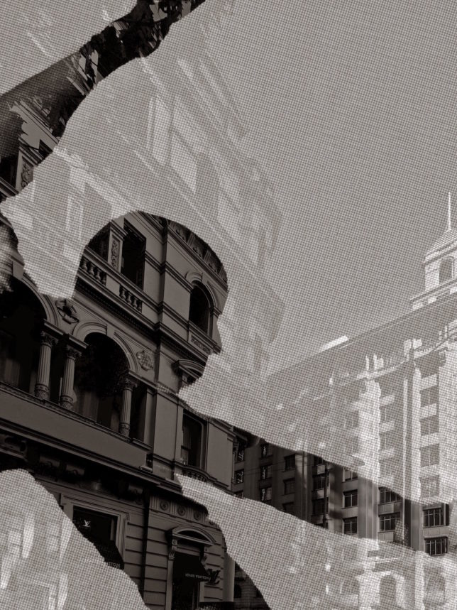
It’s an exploration of the darker yet sometimes more lyrical qualities of design. Cities are composed of a complex DNA. The human form absorbed onto and into buildings makes a connection as to why buildings are made and what they offer, not merely as containers but occasionally with functionality and artistry. Think of Frank-Lloyd Wright’s coiled New York Guggenheim, Norman Foster’s game-changing Hong Kong and Shanghai Bank and Jean Nouvel’s latest art gallery in Abu Dhabi. 

Do you believe it marks a shift for you from commercial to fine-art photography?

In many ways it’s a natural evolutionary process. Personal work is a pretty important expression of who you are. Much more so than commercial photography where you record the work of others. Private work is your own invention and your own freedom.

I like to say that the film side of my work gives a project wings – in other words it allows projects to travel around the globe rather than remain earthbound in the one spot. Private work is similar. It frees me to explore other possibilities and to be my own client.

It’s less of a shift than a development from 30-plus years shooting and filming commercial work. A fine-art approach has always been there but now there is a greater abstraction to the images and this is most evident in the recent series, Incandescent and Tattooed City. These are products of my own invention rather than shot to a brief. It’s liberating and testing to be as original and inventive as possible. Interestingly both themes really consider the urban condition of crowded cities with the largely solitary figure.

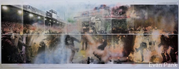
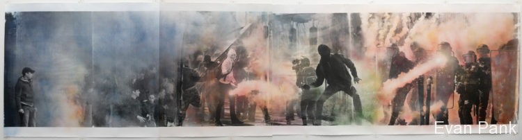
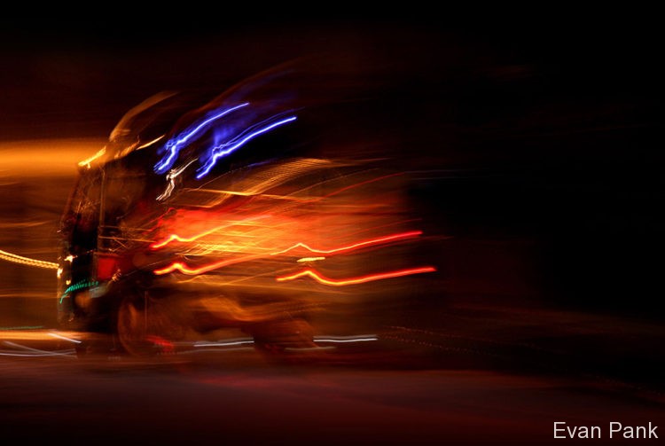
Incandescent explores the city as dark carnival. High-voltage images comprising points of light and shadow are transformative windows-to-the-world. Vivid, abstract mosaics are achieved through veil, focus and structure to give subjects greater energy and voice. Tattooed City continues this exploration of the city as a canvas to re-imagine buildings and their creators.

The figures of dancers and gymnasts are an interesting metaphor. Why did you choose this approach?

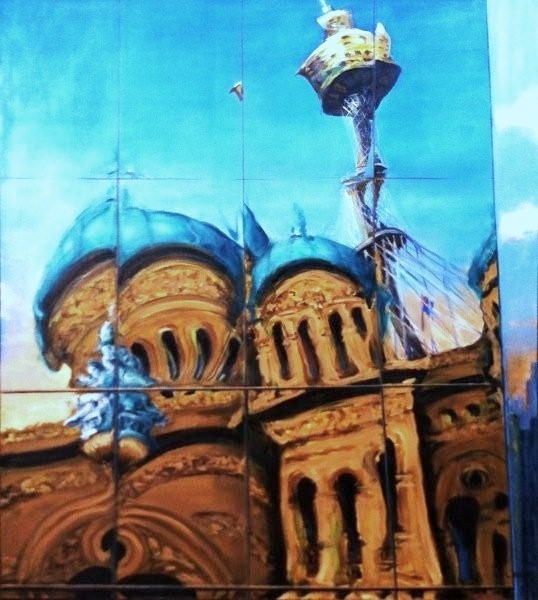
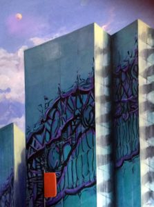
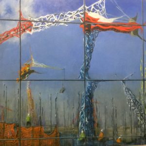
Tattooed City explores the role of the architect in city-making. The architect is depicted throughout in a shadow-play of graceful dancer or darker force projected onto their creations. In effect, the architects are tattooed into the fabric of their work, striking poses, athletic and balletic, celebrating or escaping their creations. They are consummate performers with a haunting presence and connection to their work. While their buildings are solid, the architects are enigmatic as shadow, spectre and silhouette. Tattooed City reveals the dance of design, variously sublime and deeply flawed. Architecture is easily steered off course by pragmatism so I’m trying to reveal the often-precarious nature of the designer’s role as athletic and yet vulnerable. 

Where did you find the dancers and gymnasts and was it difficult to persuade them to be involved?

The dancers and gymnasts were photographed anonymously, and they remain that way – purely as silhouettes, shadow and outline. They aren’t meant to be recognisable but rather symbolic, emblematic, abstract. I wanted to tighten the association between the designer and various buildings, not so much literally as figuratively, and I liked the idea that black and white better conveys the idea of the tattoo. Once buildings are handed over, it is as if the architect is handing over their child. Hopefully, it’s a well-behaved, fully considerate child who will delight, as well as protect, their occupants. The architect as fleeting shadow represents the transitory nature of their own involvement. Tattooed City is an attempt to acknowledge this imprint or DNA in designs mostly, but not always, as a positive.

What, and where, are the buildings and why did you choose them?

The buildings and structures are diverse and mostly drawn from Melbourne and Sydney. A number are highly identifiable such as the Sydney Opera House, Bolte Bridge and Manchester Unity from Melbourne. Utzon was, of course, a genius and yet even he grappled with the complexities of bureaucracy and budget constraints. In one image, the architect resembles a cliff climber clinging precariously to the underside of a rock ledge yet athletic enough to prevail. Each image has a similar story of the human form coiled, compressed or extended to achieve the required task.

How did you set up the tattooed artists and their poses?

The wonders of Photoshop came to my aid here and involved countless hours of blending images and inventing to seamlessly create details for a fit between the architect as gymnast/dancer with the buildings I photographed. I see a strong correlation between the artistry of these other disciplines in the line and form of all the best buildings. Great buildings have great bones, musculature and skin. Their beauty is fantastic to behold. I wanted to convey that sense of wonder in these images that I hope celebrate some of the best that as humans we can realise. 

Why select this particular imagery and how long did it take to create each scene?

Longer than I imagined.  I found myself engrossed in producing each image. The parallel with architecture and dance is that with hard work the final product appears relatively effortless even though we might marvel at how such a thing was achieved. I think the recipe is in taking the risk and not knowing the outcome with any real certainty. Sometimes you turn a creative corner during a work and it takes on a whole new life because of one new idea or realisation and that slingshots you off in a new direction that can have consequences for the whole series of work.

You mention the architect “as fleeting shadow representing the transitory nature of their own involvement”. Could you elaborate on this?

The dance aspect of design can be complicated and becomes riskier the greater the level of complexity. Architects often face an ascending spiral of expectation. Each performance must be backed up with the next as good as and, preferably, better than the one that went before. In some ways the figures and buildings in Tattooed City represent that degree of difficulty, of striving, failure and success.

What informs your view of the “human form coiled, compressed or extended to achieve the required task”?

The sheer athleticism of the dancers/gymnasts provides a useful metaphor of architecture at its best – a grappling and clinging to ideas in the face of adversity. My images try to represent that dance and artistry. The reason memorable buildings are in short supply is that architects are either overlooked, or they fail; they fall and are swept aside. Even though some of the images from Tattooed City appear bleak or dark, there is also an uplifting and hopeful human spirit that aligns with those magical qualities of amazement and wonder about the best work.

Tattooed City was shown in Ballarat (as part of the Ballarat International Foto Biennale, August 19 – September 17, 2017). How was the exhibition received by the curators, organiser and visitors?

Ballarat just happened to be the host city. I don’t really see much of a correlation between my work and Ballarat. The human-like quality of skin and bones, for example, is playing with the idea that a building can have a certain life-force and meaning because of what has been invested in it. Buildings do acquire history and meaning and are stage-sets for all kinds of events, great and insignificant. Some more so than others. I’m much less interested in the postmodern association of buildings overt in their expression. The lace-like patterns and shadows of Victorian-era terraces, for instance, remind me of the effect achieved when a woman’s face was delicately patterned with a fascinator or veil. Photography can be the full mega-pixel blast, or veiled and abstracted. Images and architecture that are gentle can also be powerful and moving. They comprehend light – and shadow where something is left implied. This invites the viewer to do some of the work. 

To put this in context, can you talk about your history as a photographer, publisher, writer, corporate communicator and anything else relevant from your varied career?

Steel Profile launched in March of 1981 when I worked in the corporate communications area of BHP. The steel division was a supporter and sponsor of architecture but not as an active participant. Steel Profile gave the initiative back to how a company could wisely, and creatively, invest its funds rather than simply handing over sponsorship money and hope for the best.

In many ways Vision is an evolution of Steel Profile but stands very much with its own identity. I began Vision for Pilkington the glass manufacturer (now Viridian) in 2002 a couple of years after my editorial position at Steel Profile ended (although I have remained a constant contributor as both a writer and photographer). Vision has changed from a printed to an e-magazine and in the past couple of years we have added video content. It comes out eight to nine times a year, and each issue runs to around 50 pages with two film segments where we interview the architects and put the moving image to work to reveal the design.

In both instances, my clients trust me to deliver a concept that would resonate with the readers/viewers. That’s a useful distinction now – we have viewers in addition to readers.

I have promoted the idea of good corporate citizenship by underwriting the recognition of outstanding design. It’s about rewarding people across creative and technical fields who use steel or glass in exceptional ways. In each case we have thrown away the whip of product promotion and told and photographed stories about ideas, beliefs and endeavour. And rather than only feature the usual design faces, we have tried to recognise emerging talent wherever possible. 

My first book as writer and photographer, Local Heroes: Architects of Australia’s Sunshine Coast, was the result of covering the work of Gabriele Poole, John Mainwaring and Kerry and Lindsay Clare for over two decades for Steel Profile. I loved work so specific to place and time and yet timeless. And with such an authentic response to climate and place. Their design is full of humility yet audacious in its invention and simplicity.

Each publication and the video content are fuelled by ideas – the architects who my partner Jenny and I interview – and my own editorial view. Having a certain belief and confidence to present an editorial position is important and a valuable quality for these clients to ensure they are considered serious participants in the dialogue with their audience/readership.

I have been a keen photographer since my teens and so when the opportunity arose to use the camera professionally it felt entirely natural to utilise my curious eye. I studied professional and creative writing, majoring in scriptwriting at Victoria State College following early training as a journalist. All my writing experiences from poetry to technical writing inform how I see – and record – the world through the lens and on the page.

Why and when did you consider architecture and how did Steel Profile evolve?

Architecture, for me, was a bi-product of becoming more aware of a changing city in the 1970s. Wreckers and builders were demolishing the old world and creating the new. I simply made it my business to be curious about architecture. So, by the time I left journalism on suburban newspapers and writing, photography and film publicity roles, I was ready to bring those experiences into a single idea with the launch of Steel Profile. Working for BHP and the steel division specifically, I wanted to project the idea of molten steel translating into some extraordinary applications and my first story in the first issue of the magazine was with a then relatively unknown Glenn Murcutt. In many ways he was a sign of much greater things to come in Australian architecture and featuring him as the Cat on the Hot Tin Roof signalled an enduring regard and bond long before he received global plaudits.

It went from there. I accompanied him to Arnhem Land, New Guinea and Helsinki where we filmed his Alvar Aalto award in 1992 for the documentary I directed, titled Touch the Earth Lightly. I filmed him in Rome in 2002 accepting the Pritzker Prize. Interviewing and photographing some of the profession’s best has been highly motivating. (DS: Hyatt also profiled Murcutt for the 30th anniversary issue, in a tasteful homage to his influence.)

Inventing (for want of a better word) Steel Profile was very satisfying because I had to argue for the magazine to rise well above the perception by marketing people that it should become a product brochure. At the time of our launch there were relatively few design magazines – Belle, Vogue Living, Architecture Australia. It was interesting that Steel Profile became a collectable. Even after all these years, I’m asked for back copies or people tell me that they have collected every issue. (DS: The State Library of New South Wales has bound copies of 1980s and 1990s issues and then loose ones.) Commercial buildings, university campuses, aquatic centres, exhibition halls, museums, early days of sustainable projects, architects you instantly recognise and others less well-known; Steel Profile’s influence remains wide. It’s satisfying that corporations can demonstrate a more altruistic attitude when connecting with their stakeholder audience.

BHP’s support for Steel Profile included sending me to China, Japan and North America to discover a range of startling and innovative projects, all important to share with readers. Among them were Kengo Kuma’s sublime Atami Villa, Norman Foster’s exquisite HK Bank, Ed Niles’ climactic Sidley Residence, Malibu and David Ming Li-Lowe’s ground-breaking Earthquake House in Los Angeles.

There are inevitably commercial pressures to improve publications with product placement. Steel Profile identified and showcased interesting people and projects and did so without overloaded product placement or the dry reviews of the mainstream architecture press. By the mid-1980s we were also producing video content under the Steel Profile banner and this really gave the magazine a whole other voice.

One of the toughest aspects of the job is to develop an expertise as both writer and photographer while simultaneously shooting film for various documentaries on design. I still have to explain the various strands to some people who have trouble understanding the multiple roles my partner Jenny and I perform. Those creative and technical acts though never exist in isolation. Each creative act informs the other.

After taking city pictures over the years for residential and commercial projects, why, and when, did you decide to take more abstract, artistic portrayals of the city as in Tattooed City?

I’ve photographed architecture for more than 30 years. I’ve loved the challenge of capturing the defining image wherever possible. Photography is a form of distillation reducing form and space to its most elemental. Visual simplicity and elegance are key goals for me to help communicate the architect’s work in the most effective and artistic way possible. While much of my commercial work has indeed been commercial, I’ve always tried to bring a subjective eye to interpret rather than merely record.

My CV (see Bio below) is very different from most photographer’s working in the field. In the past few years I’ve tried to rely less on incoming calls for my work than to generate my own. I had a strong urge to consolidate all my experience and produce my own art rather than always responding to a brief. I’ve also just completed a manuscript for a novel with this very same title – Tattooed City.

What are your views on the role of the architect and architecture in shaping cities? 

I’d much prefer architects be given greater scope and oxygen to contribute to our cities. Too often other forces – usually in the guise of committees or ‘collaboration’ – render architects impotent and unable to realise their vision. A tiny fraction of most cities reflect architecture and instead are the antithesis of great design. Unfortunately, cities are underwritten by wealth fund managers and large building groups who too rarely allow architecture to blossom. Great ideas are easily diluted by ‘value management’. Think of the great buildings such as the Sydney Opera House, Guggenheim in New York and Bilbao, Hong Kong and Shanghai Bank and a handful of jewel-like towers and dwellings. The architects are the deserved stars here because they had sublime vision and incredible resolve.

Do you think there is any hope that architects will be allowed to rise above forces such as committees and other bureaucratic collaboration, to produce great design and have that built, and have the mental strength to retain their “sublime vision and incredible resolve”. How important have you found the architect/client relationship to be in producing a great, memorable building?

It’s a fine line between collaboration and committee. Real collaboration is uplifting and inspiring while committees tend to tick all the boxes, which explains why we see so many big, boring building boxes. I can’t imagine a Sydney Opera House delivered by a committee, but it could occur through collaboration and singular vision.

Great ideas are very easily diluted by value management” – it would be great if you could expand on this. 

One of the major complaints I hear from architects on larger commercial projects especially, is the role of value management in diminishing and diluting real design vision. Great buildings require this vision along with an appreciation of the countless nuances that comprise the considerate, thoughtful building that inspires. Value management can easily discount and strip away the generosity of ideas and elements that ensure architecture is in perfect pitch with its place – much like an old-fashioned tuning-fork that identifies the right musical note. It’s easy to say: “Oh, you can do without those finishes, or that space”. Knocking ideas over is much easier than creating them.

In our documentary Heart of Glass on the making of 1 Bligh St. Sydney, you can rightfully say the architects Christoph Ingenhoven and Achitectus were the designers, but Victor Hoog Antink, the CEO of Dexus, championed that building at Board level to protect the generosity of ideas it contained. The architects acknowledge that. That role of patron saint, of informed benevolence, is essential in architecture and for that matter in photography and film-making.

The loss of those enriching components and parts convert greatness to mediocrity. Maximum net lettable floor area might immediately appeal to investors, but the lost delight of say, a mezzanine, forecourt landscape, rooftop garden, or use of inferior materials can be the difference between commercial success and failure over the longer term and come back to trash the investment.

Do you see your brand as the mix of writer, photographer and film producer?

I’m not sure how much early study was an influence. For me it’s what Ansell Adams referred to as: “You don’t make a photograph just with a camera. You bring to the act of photography all the pictures you have seen, the books you have read, the music you have heard, the people you have loved.” I’ve had various mentors along the way and mostly they have taught me to back my judgement rather than to continually look over my shoulder.

What is your novel about and in writing this are you responding to the DIY zeitgeist?

The novel is completed but is being polished. It’s about an architect who finds himself in a desperate plight financially and personally and wondering whether he’s up to a major design project that will either make or completely break him. Curiously I have run with the title Tattooed City. It has been written concurrently with my photographic work. In it the protagonist Samuel Buck has to face his own demons and those that surface as a result of his ambitions to leave a more altruistic, artful footprint rather than a pragmatic mediocrity. 

In this age of the starchitect, how can this be reconciled with your view that “architecture is too easily steered off course by pragmatism – the precarious nature of design’s role as athletic yet vulnerable”?

In many ways the art of architecture has become the business of architecture and while that’s necessary, something has been lost in the process. Predominantly business-driven, architects sometimes lose sight of the loveliness that can flow from creating work that is challenging, magical or beautiful. Risk-taking can be of the informed type rather than the crazy variety. That’s a big part of the creative process.

And next? 

I’m in the early stages of producing a documentary that brings together the lives of the authors Suzanne Chick, her mother Charmian Clift and George Johnston. Chick’s discovery of her birth mother and subsequent publication of Searching for Charmian in the 1990s has remained with me. This film project will realise my long-held interest in the lives and literature of this trio. 

Bio: Melbourne-based writer, photographer and filmmaker; specialises in architecture; written and photographed eight non-fiction books including Local Heroes – Architecture of Australia’s Sunshine Coast (Craftsman House Press), The Games Show – Australia 2000 (self-published), Out of Town (Images Publishing), Great Glass Buildings – 50 Modern Classics (Images Publishing), Masters of Light (Images Publishing) and Art House – Queensland Gallery of Modern Art (Thames and Hudson).

Founding editor of Steel Profile (1981-2001) and Vision (2002-2018); documentaries include Sir Norman Foster, Sir Richard Rogers, Glenn Murcutt – Touch the Earth Lightly, Heart of Glass – 1 Bligh St. Sydney, and Transformer – Chifley Tower by Rogers, Stirk and Lippman Partnership.

Produced some 50 film shorts on architecture and design under the Vision banner; with his wife and business partner/photographer Jennifer, established an online fine-art photographic gallery and film resource; finalist in the 2016 Bowness Photographic Prize; Tattooed City series featured at the Ballarat International Photo Biennale; https://hyattgallery.com.au/

Films are us – Queer Screen films represent the under-represented

It is not our imagination. Things have changed. You no longer have to wait weeks, even years, to see LGBTQI people on screen. Cinema, video, television, desktop, laptop, tablet, mobile, downloaded or real-time streaming. It does not matter; we’re here, there and everywhere.

Within reason. If a film is to change your view of the world, chances are it will screen at a specialist film festival. The 2017 Queer Screen Film Festival (QSFF) drew over 4,000 people, with 14 features, six shorts, one filmmaker event, nine sold-out sessions, nine Australian premieres, three free screenings, one outdoor screening and five festival guests. QSFF called it “a week of moving, uplifting and diverse queer stories that celebrate our community”.

I saw Desert Hearts in the mid-1980s, a lesbian classic set in Reno Nevada, where a straight-laced university professor falls for the much less inhibited ranch owner’s daughter. They do not stay together but they do not die. I could not forget Patricia Charbonneau for quite some time and was genuinely confused by how much the film moved me.

I have since looked to gay and particularly lesbian films for people I can relate to (not necessarily like), and bemoan the number of times they ended unhappily. One of the women dies, another has misgivings, a husband intervenes, parents thwart any potential relationship, or the couple simply drifts apart.

Queer Screen’s 2017 films, while not rhapsodically happy, at least avoided total angst. There was unrequited love and misunderstanding (Seventeen), reconciliation and regret about the past (Sisterhood), a new and open attraction for a 16- year-old while visiting her famous novelist aunt in Chicago (Princess Cyd) and a rousing documentary about a Mexican diva who perhaps apocryphally was thought to have slept with every woman in her home country (Chavela).

Before they are shown, however, films must be made, and then chosen and programmed. This falls to festival directors, curators of images that tell the stories, open minds, ears and eyes, to our embodied fears and joy. Talking to current Queer Screen director Lisa Rose (appointed May 2017) and her predecessor Paul Struthers you realise how seriously they take their responsibility. (In keeping with City Chronicler, there is a non-exclusive city focus.)

Lisa Rose

What attracts you to a film and does this include depictions of a city?

Cities have an influence over any range of films I would see but I would not only want urban stories, especially if you have two relatively similar films set in the same environment and even the same city. I would not select films only set in New York, for instance. You’d look for a different environment, say, to Chicago or the country or on the plains. We want diverse films and stories so do not want films just from America or from English-language speaking countries.

But you can only program what gets made. A lot of the European films are not set in an urban environment but in country areas, whereas films from Asian countries are very urban. As are films generally from English-language speaking countries, though Australian films might also have an element of road movie where they go to the outback or a country town.

Does a film sometimes call out to you that you must get that film?

Yes, if it really moves me and is something I find engaging. You watch hundreds of films and they are often repetitive. While there are many stories that people may think are unique, they are not when you are watching as many films as I have done.

I was part of the film festival programming team for several years, watching around 80 to 90 films a year to give feedback to the director and help choose the features. I have only been director since June (2017) and have already watched 74 features (the main interview was in early September with updates since) and that means I am a bit behind hand. I must watch at least 200 features for the Mardi Gras Film Festival. I’m very excited because 2018 marks 25 years of the festival.

Where have you lived and what resonates with you?

I am from Hobart. Water is probably the key thing that links Hobart and Sydney. I am not someone who enjoys going to the beach at all. I’ve often thought I should have moved to Melbourne and not Sydney, but I do like knowing that the ocean and water are nearby. I grew up in a house on the eastern shore of the Derwent River, so I could see the water from my house in high school. Water was always there and that is something I like. When I travelled in America and went inland I felt weird because the ocean was so far away.

Both Hobart and Sydney have quite similar sandstone buildings. Sydney, of course, is a very large city but I do not travel across it that often. I don’t spend much time outside the inner west and inner east. I live in Marrickville, a very particular type of Sydney, so when I do, for some reason, go further out, such as to Auburn, Hurstville or Blacktown, I realise just how different it is from the inner west. Then I think about growing up in Hobart and what a small town it is in comparison. Yet I would rather live in Hobart than in the outskirts of Sydney because the traffic is amazing, not helped by having a giant harbour in the middle. The infrastructure is inadequate, the planning and everything.

I went to Las Vegas once for a night though it is not my cup of tea. I’m glad I went though. I really love New York. It is the city I have wanted to go to more than any other in my life and it took me 37 years to get there (she was almost 40 at the time of our interview). I eventually went by myself for 10 days. There are more films set in New York than any other place in the world, and I have watched so many of them, but New York still exceeded my expectations. People say it is the city that never sleeps and, literally, it is the city that never sleeps. You can do something at any hour of the day or night. It has an energy that is really appealing. I felt safe when I was there. I loved the public transport, just being able to catch the subway and how the lines all connect.

The blocks are so small you can walk 12 blocks and not feel like you are walking. I just loved it and would move there in a second (if I could). Yet friends have moved there and been disappointed. It’s a bit of a hard town. People are friendly, give you a lot of help and answer questions, but I have heard it is difficult to make friendships in New York. So many people move there, trying to get a break, make their life and all that sort of stuff.

Recent films she has liked

At the 2017 festival, I liked After Louis, which was set in New York. It’s about an artist who has a lot of pent up grief about the people he lost during the AIDS crisis. He connects with a younger gay guy who is very open. Although a lot of films have been made about HIV and AIDS, I found this one incredibly engaging because it’s intergenerational, and confronts what young gay men are doing now and asks are they aware of what happened before then. The performances are excellent.

I have been associated with Queen Screen for five years. QSFF17 featured our first mixed gender and sexuality comedy shorts package, which was a lot of fun with much laughter and positive feedback. I am really pleased, from a curatorial aspect, with how that and the whole festival was received.

We had been asked about comedies more than anything else. People could do with more laughter, so I sought out films for the package.

I also thought Sisterhood was an interesting film, a contrast of cities seen through the eyes of two women, good friends, former masseuses who drift apart. The film is funded by Hong Kong, Taiwan and Macau. It starts in Taiwan, then has flashbacks to Macau and its return to China from Portuguese control in 1999. “This is no longer the Macau I know,” says one of the characters as she visits the city after nearly two decades away, and sees it in its new status as the Las Vegas of Asia.

Of the 2017 Festival films, Dream Boat about a cruise for gay men was a conversation starter. Our programming team loved it. It covers a gamut of men with different backgrounds, races and abilities. A few of the team said they found it entertaining and it made them think about who they find attractive, who they want to pick up in a room. It made them think about things at a deeper level and I hope it started some conversations with themselves, internal and external conversations.

(Though not in the Festival), I adore Moonlight, which won best film at the Oscars. It’s a perfectly realised film about a guy growing up in the ‘hood in Miami, told in three different chapters, where he is at ages 8, 17 and 24. It is about internalised homophobia and hyper masculinity.

Paul (Struthers) was pleased we had more Asian films in 2016 and I was consciously looking for Asian films in 2017. For a film festival that exists in a predominantly Anglo-Saxon country, we probably show more Asian films than any other queer festival. For instance, they do not get shown as often in America, but with our proximity to Asia and a large Asian population, it is good to see Asian films and faces on our screens. We absolutely seek them out. We also had a panel session with directors from the Asia Pacific Queer Film Festival Alliance (APQFFA), and it was packed.

APQFFA is a collective of regional film festivals. It was founded in 2015 in Taipei, and aims to support and promote films and filmmakers from across the region and push for greater international visibility for Asia-Pacific queer cinema. Its members are:

Love Queer Cinema Week (China) ShanghaiPRIDE Film Festival (China) Hong Kong Lesbian & Gay Film Festival (HKLGFF)  Taiwan International Queer Film Festival (TIQFF) Mardi Gras Film Festival (Australia) &Proud Yangon Queer Film Festival (Myanmar) Tokyo International Lesbian & Gay Film Festival (Japan) Bangkok Gay & Lesbian Film Festival (Thailand) Q! Film Festival (Indonesia) Honolulu Rainbow Film Festival (USA) and Korea Queer Film Festival)

Film study at the customer coalface

I have always been very into film. I was not sure what type of film I wanted to study or exactly how to go about it. Instead, I worked in video stores for nearly 10 years along with various other jobs. I started the first gay section (“pink-shelved” as Queer Screen calls it) in a Blockbuster store. I have always been very dedicated to queer stories being told on screen. It’s how I got, ­­­and still get, my entertainment so having had five years of thousands and thousands of hours of watching film, to be able to do that for a living and making that happen as a career is a dream come true.

Next year is the 25th of the Mardi Gras Film Festival and we are polling the top 25 films of all time. You will be able to do it online at queerscreen.com.au. You may have a film that helped you come out. So many people do. Mine probably is When Night Is Falling. (Patricia Rozema’s film has an uptight woman, working on tenure as a literacy professor at a large urban university, attracted to a free-spirited woman who works at a local carnival that comes to town.)

I watched the film with my boyfriend at the time when I was working at the video store. We rented the video, watched it, he left for the night and I watched it again. We broke up not long afterwards and I did not have another boyfriend. So that is quite an important film to me.

Heritage of the films influential to her

I thought Love and Other Catastrophes with Radha Mitchell and Frances O’Connor as two film-school students trying to find love, was a great film.

It makes me feel good and I could watch it again and again because it was a rom com. So many people want a rom com and yet there are so few good queer rom coms. I remember Saving Face 2004 (a Chinese-American lesbian and her traditionalist mother have secret loves that transgress their culture). Joan Chen was the mother and she was popular here at the time.

Another film I like is It’s in the Water. It’s a low-budget film (from 1997), set in Azalea Springs, a small town somewhere in Texas. It’s ultra-daggy and hilarious. A camp gay guy gets drunk at some Republican gathering and says to some people that gayness is in the water. It then becomes a big scandal with people shipping their water in and not drinking tap water.

I also like it that one of the lead characters is a lesbian and the other is a gay man. There’s also a subgroup of bisexual women and another gay man. It’s rare that narrative films are made that feature gay men and lesbians. They are very much separated, yet I know that is not what my life is like. I’ve lived with a gay man. It does not get explored enough.

Better than Chocolate was daggy too. (Set in Vancouver, two young lesbians have a passionate romance, move in together but things get complicated when the recently divorced mother of one of them stays with them.)

What most pleases her about the 2018 program?

We have the most played lesbian film on the LGBQI Film Festival circuit 2017, Signature Move, (a 30-something Pakistani, Muslim, lesbian in Chicago who takes care of her TV-obsessed mother falls in love with a lively Mexican woman, leading to some important soul-searching), and a Sundance Award Winner in Beach Rats. We also have the debut screening of Australian supernatural web series, Jade of Death, which was a previous recipient of the Queer Screen Completion Fund, and the National Film and Sound Archive restoration of Witches and Faggots, Poofters and Dykes, which is arguably the most important queer documentary in Australian history and a testament to the strength of the 78ers in the 40th anniversary of Mardi Gras.

More background on Lisa Rose: The Queer Screen website states: Lisa is a “passionate believer in giving voice to all forms of queer entertainment, and is focused on showcasing and championing diversity. She increased the number of women on the Queer Screen Board, the volunteers, members and audiences, the lesbian content and has hosted and participated in panels and forums including the Lesbian Filmmakers Forum, Trends in LGBTQI Cinema and for popular web-based lesbian drama, Starting From… Now!

On her appointment as director, Lisa said: “I am deeply passionate about realising Queer Screen’s mission to transform and engage individuals and communities through queer storytelling on screen and am thoroughly motivated to continue to build on the fantastic growth, success, direction and sustainability that former Festival Director Paul Struthers, the Queer Screen Board and greater team have achieved over recent years”.

Paul Struthers

I had heard Paul many times introducing films and their directors and cast at festival screenings but first interviewed him in 2016 in the rambunctious Queen Screen office. A year later, we chatted again over his home-made, Tupperware-packed, salad, in the more sedate Sydney Film Festival offices. Exhausted from back-to-back festivals, he was set to move on with his younger, Australian-Chinese partner, who was wanting to live somewhere else.

Having connections that click for you

In London, I was a marketing executive for four years. I also worked at film distribution, which I found quite stressful in the UK. Films open on a Friday, so I would always be nervous on Mondays about whether the sales campaign was a success.

I looked after a mixture of films, not all commercial; there were some Aussie films. I particularly loved Jindabyne.

I quit and came to Australia. I had studied media arts at Royal Holloway University in London. I am not a career person. I find office jobs quite stifling. I just came to Sydney. My brother lives here and people from school and university, and from my time in London.

I’ve always been very good at networking though I hate that term. I don’t care what the job is; I just care that they have values. Because I’ve always been good at talking to people, I met up with a guy soon after I arrived here, and had about 10 contacts I was supposed to meet with, given to me by people in London. I contacted them. My friend had gone to the Cook Islands, so I went there expecting to spend a month.

But when I got there and checked my email, one of the people I was supposed to be having a meeting with said the head of transmission films had had lunch with the director of the Sydney Film Festival and there was a job going in marketing. I sent my CV the next day, had an interview and two days later I started. So, my work history in London was important. (He was 28 when he got here; 35 at the time of the interview with me).

My job was as a marketing assistant and that suited me as I did not want any accountability. However, after a few weeks they changed my title, and I became marketing manager promotions, which helped me build up a marketing reputation. Someone then approached me, saying ‘queer screen needs help’, so I joined them, doing marketing and programming. Then the job came up (in 2014) as Queer Screen director and I applied for it, and got it. So that’s the history.

Building on a film legacy

I came for a change of scene. I had always wanted to live somewhere else and wanted blue skies and beaches. I did not come here particularly for the arts and culture, because I had had my fill of that in London. But Sydney is a place that’s grown on me. You can’t beat the lifestyle. I live in the city and also love to live by the sea. All my friends are nearby. I’ve lived in South Newtown and Enmore. When I first came to Sydney I lived in Surry Hills and Redfern. At university I lived in Egham, Surry, where my university was (Paul has a Bachelor of Arts from Royal Holloway University) but I then lived in across London, in New Cross in the South-East, and then north in Tufnell Park and Stoke Newington.

It is important that there is something for everyone at the festival. Diversity is so important, with quality films with people from different walks of life, from different countries. Showing films from Asia-Pacific is very important. Often, we feel the oppressor, and are very racist. We have our type, what we are fed by the media about what’s good looking. There’s too much of a hierarchy but we keep on fighting, keep going. I want to give back to society and have been fortunate enough to be able to do that. (Paul is Scottish. His mum works in hospitals and his dad is a professor of economics.)

How important was his sexuality to the Queen Screen role?

It’s so funny because before doing that job, although I’m a gay man, sexuality was such a small part of who I am. My life changed a bit after I got the Queer Screen job because I had to go to LGBTQI events and you’re representing an LGBTQI organisation. That became important because with Queen Screen you can make a difference especially with younger people who need support. They need to see stuff that shows gay life in a positive light, so they feel comfortable coming out.

Films that have stood out for me include Reaching for the Moon, a love story of an American poet (played by Miranda Otto) and a Brazilian architect, and Pride, a wonderful film about a group of gay activists in London in the 1980s who end up raising money for miners who initially don’t want to be associated with gays. But the two groups of minorities come together and it’s a beautiful story.

And where to now?

I did not manage to speak with Paul again. He flew out at the end of November for his latest job, the newly appointed director of exhibition and programming of Frameline, which includes the San Francisco International LGBTQ Film Festival, which celebrates its 42nd anniversary. June 14-24, 2018. Back in 2014, Queer-Screen sponsored his attendance at Frameline so it is almost like a homecoming.Screendaily.com reported Frameline board president Michael Colaneri praising Paul’s “collaborative skills to link audiences and partners alike in building support for the exhibition of queer media across multiples platforms. Paul is an authentic communicator.”

“I’m thrilled to be joining Frameline,” Paul said. “(It) is an organisation that has always inspired me in their world-leading approach to showcasing queer cinema.”


Mardi Gras Film Festival, Feb 15 – Mar 1, 2018 and Queer Screen Film Fest, Sept 2018.

City maker Thanh Tam Cao

Capturing dualities in light and location, night and day

The all-too familiar Golden Arches of McDonald’s fronted by a bulging, rubbish bin and ibis hovering, pecking, hoping for food scraps. A fenced-off paddock, a stationary white car with its headlights on and, in the distance, rolling hills, a peaceful scene tinged pink by the sky. These unlikely juxtapositions mix the imaginings and reality of Thanh Tam Cao’s work, a selection of which will be on show as Night & Day, at Gallery 371, September 15-28.

I first met Tam in a Sydney pub at a meet up of what were called Momentum Warriors (now retitled Authentic Influence Warriors). They were mostly keen mid-20s to 30-year-olds, digital, marketing, creative and social entrepreneurs full of ideas and promise. Tam fitted in perfectly. He was excited about the series of pastel portraits he was preparing for the inaugural Art on the Walk Competition at Henry Deane Plaza in Central. (He took home first place.) My sense that he would be an ideal City Maker was further confirmed when he gave me his business card, illustrated with a pen and ink drawing of a heritage pub in Parramatta. He said he worked out of Pop Up Parramatta Studios. I met him again in August, first in a café near Parramatta station, and then at his studio, where work was in progress for his first solo exhibition.

Art is his life-blood

At high school, I had no idea what I wanted to do. But I had sketched a lot at primary school, drew and painted too, mixing ideas from my imagination and from what I could observe.

I went to public schools in Smithfield. I had a few friends who could also draw and we were always trying to outdo each other. One was so good with colour and comic book characters, Spider Man and the like, that I spent my lunch money buying his work. We were still very young. I asked him if he had copied it but he said it was all freehand and from his imagination. I was inspired and felt I had to try it myself but was so frustrated that I could not do it properly.

I met him years later, and reminded him about this time. He vaguely remembered. Then he told me that it was not his own work (Tam guffaws at the memory of this revelation). Still it helped me develop my own eye and believe in the possible, especially as I thought he had done it his own way. So, I was kind-of tricked into drawing from my imagination, with the realistic images around me helping me hone my eye.

What has most frustrated him

I always knew that I needed help but didn’t know anyone who could teach me. I was working out what the obstacles were, trying to develop artistic fundamentals on my own, such as understanding form, perspective and tone. I just kept drawing. I had had a couple of art lessons at primary school and my parents probably made some sacrifices because they knew I really wanted to draw. They supported me.

I’m lucky by default. I have lots of brothers and sisters and think that if I was an only child I would not have had the chance to draw.

(Tam was born in 1985. His parents had left Vietnam two years earlier on one of the last boats to leave during that time. An Indonesian woman picked them up. They were processed there and then had to choose between going to Australia or Canada.)

I am so happy they chose Australia. I can’t bear the cold. I have four sisters and two brothers, all born in Vietnam. They all have responsible jobs, accountants, a banker, property manager, community services worker, a housewife, and one who is also a comic.

As for me, being an artist, left-handed and vegan makes me feel different. I’ve had lots of odd jobs, and my first job where I could work five days a week and earn quite a bit of money was as a bartender at an RSL club.

Serious about his art

It may be a cliché but I think it is important to know the rules before you can break them. The very foundation of drawing and painting is to transform something three-dimensional, whether it be what we see or what we invent, and put it onto a two-dimensional surface. Before you can do that, you must understand what it is you are trying to say, and then you must know how to express it. Without a classical training, your work can lack substance and depth despite having the stories to tell.


It may be a cliché but I think it is important to know the rules before you can break them. The very foundation of drawing and painting is to transform something three-dimensional, whether it be what we see or what we invent, and put it onto a two-dimensional surface.

I started my training at the Julian Ashton Art school in the Rocks in 2007 and received the John Olsen Scholarship in 2010.

I sketch first and draw to work up the composition. If doing pastels, my medium of the moment, I go straight for colour and then move the scene. I fix up the painting, brushing as I go. The amount of time this takes varies.

I wonder if it is ever possible to nail it straight away but my strike rate is getting better, the amount of good work to bad work. I put the painting into Photoshop half-way through to better work out colour and so on. I do like traditional methods though, the tactility. I can’t go straight into digital. I am not ready for that yet.

My artistic influences include artists from the Romantics era, such as Caspar David Friedrich (19th-century German Romantic landscape artist). His landscapes are so beautifully painted either day or night, you don’t know whether the sun is setting or rising. I love his work purely aesthetically. I also like Tim Miller, an Australian artist, who lives in a rural town, Rockley near Orange, and Sam Wade, a former teacher at Ashton.

I have lived in Sydney all my life, with my parents, in Marrickville for a couple of years and then out to a larger home in Smithfield. It was comfortable living in suburbia but a bit boring. I love Parramatta and Sydney because it’s big and haphazard, not like Melbourne with its grid system. Compared with other cities around the world Sydney is a liveable city.

I empathise with refugees and people from lower socioeconomic backgrounds. I am not sure if that affects my art but it makes me want to paint and draw all the time, and not be in it for the marketing side of things. You may not always know their back story but you must fill the void which I often do with something ambiguous, a lonely landscape, or subtle narrative about people that have lost connection.

First solo exhibition draws on different influences

I hope my first solo exhibition will show where I am coming from. It’s called night and day, a polarised view, a duality between night and day, between good and bad, right and wrong, one can’t exist without the other, I can’t paint the day without understanding its opposite. Half the scenes are at night, and half during the day, including transitions from one to the other. I like twilight, but I don’t want to call it that. Transitions, I think, better implies the shift in light and mood.

I hope my first solo exhibition will show where I am coming from. It’s called night and day, a polarised view, a duality between night and day, between good and bad, right and wrong, one can’t exist without the other, I can’t paint the day without understanding its opposite.


I paint all types of scenarios, capturing light at different times. Edward Hopper’s paintings of urban scenes conveying themes of alienation have helped influence some pieces in this body of work.

I’ll paint a night scene with a headlamp and a fluorescent light. I realised that the night scenes draw on the time I worked in restaurants and RSL clubs, which was often at night. Perhaps I saw things that were not very nice but looking back I mostly think of how I can incorporate this into my painting. The people you meet at night are different from the people you see during the day. I never thought I was in danger but there is a bravado mainly among the men but also the women these days, and an undercurrent of grittiness that is not there during the day. I like both times and it all makes for good stories, and has inspired me to want to become an artist.

I like to go on location. Sometimes my work can take weeks or months, sometimes it is very quick. The exhibition mixes urban and rural settings. I am drawing lots of rubbish bins at the moment, green bins, skips and others. I love the shining plastic. Someone’s rubbish is an artist’s still-life.

Someone’s rubbish is an artist’s still-life.

Everyone knows what a bin is. We’ve all taken out bins. It’s something people can relate to. Perhaps it’s an environmental thing as well. As long as we have had civilisation we have had rubbish, and the best thing we have learnt to do with it is dig a hole in the ground and forget about it, without thinking about how consumptive we are.

I am also composing animals, like the ibis, in my paintings. They are easier than people because you don’t need to make them as different as you do with people. As with the ibis. You can repeat them in a pattern around the bin. People like repetition and the familiar.

Why choose Gallery 371?

It is a relatively new gallery and I know the owner, Louise Beck. I met her a while ago at a Branding artists life drawing group, specialising in impressionistic figures and portrait art. Louise was always the one organising us. She’s a go-getter, very passionate about being an artist, entering competitions and being active in the art scene.

She had sold her house and was doing up this dilapidated terrace with a shopfront. I was driving past one day and saw her canvases. I pulled over and walked to the gallery space. We were surprised to see each other. She explained that this was her new home and gallery. I was so impressed and immediately thought, ‘why am I not doing anything with my art and my career?’.

I had wanted to be one of the first artists exhibiting there but did not produce enough work in time. She’s shown several artists already and has become quite popular. I love her location, right across the road from a nice park (Enmore Park). Marrickville has become more gentrified but I just love that park.

I plan to do workshops and landscapes there for people coming to the exhibition. If it rains, it rains. There will be a space indoors where people can come in.

What lies ahead

I teach drawing and painting at the Julian Ashton School and the Sydney Art School. I also work in an art shop in Parramatta and have done some commissions. But I want to pursue my career as an exhibiting artist. It’s about finding what I want to say with my work.

I’m also getting married later this year. I may visit Vietnam later too. I went to Japan with my fiancée this year and feel like now I have someone I can go to Vietnam with (his partner’s parents are Chinese but they also lived in Vietnam). I have travelled by myself but you have to be the right kind of person to do that, and I more appreciate having someone there to bounce ideas off.

Forget about cost when measuring the value of your travel

Do you ever feel overwhelmed by data? Do analytics enthral or bemuse you, those algorithms lurking in the background measuring your private insights, your searches, the where you go to and why?

I took two overseas trips in the last 20 months, as for many of us mixing sight-seeing and visits to family and friends. What ways could I bundle together my memories (still fresh), structuring them for later poignant, but practical, recollection?

Choose your destination

Sounds obvious but unless you are completely footloose and fancy free, having an idea of where you want to go is bound to scope your journey.

October 2015: I went to New York. Since my parents passed away, most of my closest blood relatives live there. I have visited several times over the years and identify with its block-on-block walkability. I stayed with my aunt in her New York state condominium, travelling in to my favourite station, the beautiful, effervescent and well-organised Grand Central Terminal. I also went to Philadelphia, and stayed with an old schoolfriend. We talked and talked, reminiscing about hilarious and embarrassing moments, of teachers who mattered, and about pivotal experiences such as seeing Monty Python live at London’s Drury Lane in 1974.

May 2016: My partner and I visited the UK and Germany. Manchester, my home town is as galvanised as travel articles (and then news pieces a year later after the explosion) have indicated, and was the setting for more recounting with friends. London is where I went to university, got my first proper jobs, still have friends and an umbilical cord I cannot quite break. And also to Southampton to visit my partner’s family; Edinburgh for heritage and bagpipes; Glasgow – four rushed but vibrant hours learning that People Do Make Glasgow; a mini-bus tour through the Highlands’ twisting roads and glorious scenery; and Germany, to university town Gottingen, Berlin and Dresden, renovated, historic and the throbbing, modern.

Breathless and vowing not to rush around so much next time, and to pack less, I wanted to think of a matter-of-fact list, full of holiday emotion without the frills, the more ordinary the better.

Daily shopping

We stayed in self-catering apartments reckoning they are better for our health, finances – eating out every night gets expensive – and flexibility. The location and stock of the nearest supermarket or fruit and vegetable stalls was both an entertainment and a practicality. There were lots of students and travellers staying in or living near our apartment in Edinburgh so the shops had cold meats, tinned fish, small portions of cheese and laundry packets so you could buy for a day or two. In Manchester, we were down the road and up a ramp from the main city station which had the full range of outlets. OK they were not as cheap as in the suburbs but stocked everything we needed.

The closest supermarket to us in London stayed open late, and was always packed. Southampton’s Marks and Spencers had the usual, convenient lunch ingredients and gamut of ready-made meal packs; Berlin’s Lido chain was serviceable but not a match for Rewe, my favourite, across Dresden’s cobbled inner square flanked by imposing churches. The carbohydrate, protein, fruit and vegetable staples lining the wide aisles were matched by liberal supplies of natural food, meat substitutes, grains, pulses and fresh German breads.

Airport food

Airports, overall, were functional rather than spectacular. Berlin’s Tegel and San Francisco’s stood out for choice of food. Tegel had an outlet with natural, healthy and filling snacks and San Francisco, where due to a diversion from Los Angeles en route to Newark, I had a couple of jet-lagged hours, let me wander around buying up sesame creations, an udon and vegetable box and a tofu bar that lasted me my entire US trip.

Warm welcome

Always important at hotels and hotel apartments (we did not stay at any Airbnb places), the busy Hatton Cross Heathrow Airport hotel, is a fair walk from the left luggage area (we downsized for our side-trip to Germany). People milled around reception. The computer was down and we were waiting to check in but the Spanish receptionist was unflappable and efficient. We rarely ate in hotels but here enjoyed the roast parsnip, sweet potato, lightly roasted chicken and crunchy salad, tasty and light by any standards. The place cheerfully thrived on fast turnovers, something never to take for granted on holidays.

Our best linguist was at an Aussie-owned hotel chain in Berlin. It was in a renovated former East German school still with huge stairwell mirrors, while the entrance had statues of Berlin bears covered in Aboriginal motifs. They were not as kitschy as they could have been. This was the only hotel we stayed at without free Wi-Fi in the rooms. It was only in the lobby, which understandably was packed.

Living up to its reputation, Manchester’s foyer was the noisiest (or should I say liveliest?) with soccer on the television and background rock ‘n’ roll in the bar.

Room facilities

We did little clothes washing, and that was mostly hand washing. Washing machines in Edinburgh were out of order and we had neither the time nor the motivation to go to the launderette. We arrived too late to take advantage of Hatton Cross’s plentiful, communal washing machines and dryers, prioritising eating over washing. Berlin came to the rescue as we did a load or two while watching the 2016 Eurovision Song Contest, proudly supporting Demi and missing Julia and Sam’s commentary, so much fun compared to the far more serious German presenters.

For washing ourselves, bathrooms were up to scratch though we only had separate shower rooms in Germany. In Gottingen, I kept tripping up on the tiny step up from the bedroom when I was tired. Washrooms, generally, are an intelligence test; do you turn, point, wave, push, spray? Do it once and then follow the routine.

Edinburgh had the best cooking utensils and sturdiest saucepans, and Berlin the most compact kitchen table and chairs for eating and watching TV. Dresden’s coffee-making machine was the fiddliest (I much prefer cafetieres). Mini-bar contents were stored in the fridge which, alongside our food, made it very crowded.

Temperature and power

All room windows opened except at Hatton Cross (for acoustics as much as anything as we were on a major road).

We stayed in renovated industrial buildings, many with latch-windows, but as it was early spring, temperatures were fine and generally we preferred to open the windows rather than use the air-conditioning. The German rooms impressed with their double or triple glazed smooth-handle openings, reliable and so stylish.

All rooms had enough power points. Manchester’s, in fact, was overpowering when we first opened the door as the central heating had been on for hours beforehand. This did not happen in other places.

It was hard to follow the instructions for switching on the television in Dresden; my partner understood the German but we had to ask housekeeping for help. No wonder. They explained that one remote switched on the power and another was for changing channels. Elsewhere, the remotes were much easier to work.

Sleep well

London had the biggest quilt. It had to be bunched up to fit on to the bed. Quilts everywhere came with the now ubiquitous strip of material for feet, which was great for the time of year in which we were travelling. Most places also supplied blankets and lots of pillows, Germany’s feather being the softest.

We slept on different sides of the bed in different places. I am not sure why but it was all harmonious. I was often trying to shield my partner from the light as I read or watched TV late. In Dresden, luckily, I chose the side with a direct view of the historic square at night.

Accessibility

My right leg is a bit stiff from a bad bout of cellulitis a few years ago. Climbing stairs can be difficult, especially if the tread is high. I look out for sturdy bannisters to haul myself up. Lifts and escalators are not always available and trying to get as much exercise as possible, I opt for stairs anyway. Dresden’s formidable museum entrances are a testimony to hardwearing stone, and London’s tubes rely on hundreds of steps, even on the escalators.

Above-ground station exits and entrances in the cities we visited mostly had ramps and lifts so they were accessible.

We caught taxis to and from public transport and accommodation where necessary. Taxi drivers in London told us that Fridays and Mondays were good as so many people work from home those days and, true, from my experience going from South Kensington to Waterloo on a busy Thursday and a quieter Friday that is exactly how it worked out. Gottingen was pedestrian bliss. The station to the hotel was across two roads and a bicycle lane with its own set of traffic lights and courteous cyclists who wore civvies, not lycra.

Valuable extras

Free seating on platforms is at a premium, so once found, enjoy. Treasure any storage on trains. There never seems to be enough of it and you often end up sitting a long way from your bags.

And at museums keep a sense of humour. A group of senior tourists at a major Dresden art gallery gathered around the sofa on which we were sitting. One of them plonked herself down on my partner apparently without realising what she had done even when we burst into peals of laughter.

Special cases

We stayed in a renovated, historic hotel in Gottingen. Breakfast was included. I love German breakfasts – the buffet range of sour dough or wholemeal or rye breads and rolls, the thinly sliced meats and cheeses, muesli, crackers, jams, mineral waters, splendid breakfast coffee, and now natural yoghurt (not sour cream as in the past).

I also enjoyed the former East German traffic lights in Dresden and parts of Berlin, the stubby red and green men striding out as stop/go signs (see them in Sydney at Dresden spectacle shop on Newtown’s King Street). At Edinburgh station (and possibly others in Scotland), the public toilet signs show men and women and a kilt-wearing Scotsman.

Highlight

I will say it again. Combining architecture, structure, accessibility, Grand Central Terminal, my New York commuting arrival and departure point, has the grand stairs, information desks and fantastic signage clearly showing which track you needed and which walkways to get there, to be my travel joy. The affable tour guide who took a group of us around including a bunch of lively 10 and 11-year olds from a Queens public school typified the station’s atmosphere and pride to make it my most indelible memory.

Other blogs coming.

City makers, city off-beats and city thinkers coming.